class: center, middle, title-slide # Reproducible Data Visualizations Using R and Binder ### </p> Andrew Stewart<br>University of Manchester<br>Twitter: <span class="citation">@ajstewart_lang</span> </p> <p>Oli Clark<br>Manchester Metropolitan University<br>Twitter: <span class="citation">@psytecholi</span></p> ### (updated: 2019-07-07) --- class: center # The following is a fully reproducible talk (just add my accent) All slides and R code used to generate these slides available [here](https://github.com/ajstewartlang/SIPS_presentation) <br style=“line-height:1;”> <img src="images/ssi.png" width="45%" /> <br style=“line-height:1;”> Reproducibility and The Turing Way https://the-turing-way.netlify.com/ .footnote[ Slides created via the R package [**xaringan**](https://github.com/yihui/xaringan), [**knitr**](http://yihui.name/knitr), and [R Markdown](https://rmarkdown.rstudio.com). ] --- class: center, middle <img src="images/plan.gif" width="150%" /> --- # Open and Reproducible Research Fully open and reproducible research requires: -- <b>Shared data</b> - we need to share our data with others. -- <b>Shared code</b> - we need to share our code with others. We need to ensure it's well documented so that it is usable in conjunction with our data. -- <b>Shared computational environment</b> - we need to share our computational environment with others. This includes our analysis software, the specific packages we used, plus any system-level dependencies. --- # Why do we need a shared computational environment? Quite often analysis code ‘breaks’ - often in one of two ways: -- Code that worked previously now doesn’t - maybe a function in an R package was updated (e.g., lsmeans became emmeans so old code using lsmeans wouldn’t now run). -- Code that worked previously still works - but produces a slightly different result or now throws a warning where it didn’t previousy (e.g., convergence/ singular fit warnings in lme4 version 1.1-19 vs. version 1.1-20). -- Arguably, sharing only your data and code means you are not engaging in fully reproducible research practices. --- .center[ .middle[ <img src="images/peng.png" width="100%" /> ] ] --- # Make your Visualizations Reproducible "<i>(visualizations)</i> should be autogenerated as part of the data analysis pipeline (which should also be automated), and they should come out of the pipeline ready to be sent to the printer... ...the moment you manually edit a figure, your final figure becomes irreproducible. A third party cannot generate the exact same figure you did." .pull-left[ .center[ <img src="images/wilke.png" width="200" /> ] ] .pull-right[ <i>Claus Wilke, Fundamentals of Data Visualization (2019). Page xiii.</i> ] --- class: center, middle <img src="images/wilke_tweet.png" width="783" /> --- # A workflow for reproducible science in the Tidyverse .center[ <img src="images/tidyverse.png" width="90%" /> ] --- # A workflow for reproducible science in the Tidyverse <img src="images/tidyflow.png" width="1200" /> https://www.tidyverse.org --- class: center, middle # Why Data Visualization is Important --- class: center, middle # Anscombe's Quartert --- # Plot 1 .pull-left[ <!-- --> ] .pull-right[ ``` ## [1] "Mean of X is: 9" ``` ``` ## [1] "SD of X is: 3.32" ``` ``` ## [1] "Mean of Y is: 7.5" ``` ``` ## [1] "SD of Y is: 2.03" ``` ] ``` ## [1] "Pearson's r is 0.82" ``` --- # Plot 2 .pull-left[ <!-- --> ] .pull-right[ ``` ## [1] "Mean of X is: 9" ``` ``` ## [1] "SD of X is: 3.32" ``` ``` ## [1] "Mean of Y is: 7.5" ``` ``` ## [1] "SD of Y is: 2.03" ``` ] ``` ## [1] "Pearson's r is 0.82" ``` --- # Plot 3 .pull-left[ <!-- --> ] .pull-right[ ``` ## [1] "Mean of X is: 9" ``` ``` ## [1] "SD of X is: 3.32" ``` ``` ## [1] "Mean of Y is: 7.5" ``` ``` ## [1] "SD of Y is: 2.03" ``` ] ``` ## [1] "Pearson's r is 0.82" ``` --- # Plot 4 .pull-left[ <!-- --> ] .pull-right[ ``` ## [1] "Mean of X is: 9" ``` ``` ## [1] "SD of X is: 3.32" ``` ``` ## [1] "Mean of Y is: 7.5" ``` ``` ## [1] "SD of Y is: 2.03" ``` ] ``` ## [1] "Pearson's r is 0.82" ``` --- # Plots Based on Aggregated Data Can Mislead… .center[ ```r ggplot(data1, aes(x = Group, y = RT)) + geom_boxplot() ``` <!-- --> ] --- # But look more closely at the actual data… .center[ <!-- --> ] --- # The distribution of data matters The data on the previous slide are clearly bimodal with no data point near the mean. Distribution shape matters and we need to capture that in our data visualizations. If we only plotted and reported information related to aggregated data, we wouldn't be being honest about what our data look like. --- # Reasons for visualizing data -- For yourself - once you have collected your data, you should visualize it before you build any statistical models - does the data look (roughly) as expected with the right number of data points? -- For others - when you present your work in a talk, on a poster, or in a published paper you want the viewer to be able to quickly and unambiguously extract the intended meaning from your visualization. -- Just as the reproducibilty of statistical models is important in the context of engaging in open and reproducible science, so too is the reproducibilty of data visualizations. --- # ggplot2 The ggplot2 package is part of the Tidyverse and is based on the layered Grammar of Graphics (Wickham, 2010): https://byrneslab.net/classes/biol607/readings/wickham_layered-grammar.pdf Start with defining your data and aesthetics of the plot, before adding geometric objects (geoms), information about labelling, faceting etc. Each plot can be built up gradually, layer by layer like the following: --- .top[ <!-- --> ] .bottom[ ```r ggplot(data_long, aes(x = Condition, y = RT)) + geom_jitter(alpha = .25, position = position_jitter(0.05)) ``` ] --- .top[ <!-- --> ] .bottom[ ```r ggplot(data_long, aes(x = Condition, y = RT)) + geom_jitter(alpha = .25, position = position_jitter(0.05)) + stat_summary(fun.data = "mean_cl_boot", colour = "black", size = 1) ``` ] --- .top[ <!-- --> ] .bottom[ ```r ggplot(data_long, aes(x = Condition, y = RT)) + geom_jitter(alpha = .25, position = position_jitter(0.05)) + stat_summary(fun.data = "mean_cl_boot", colour = "black", size = 1) + geom_violin(aes(fill = Condition), alpha = .2) ``` ] --- .top[ <!-- --> ] .bottom[ ```r ggplot(data_long, aes(x = Condition, y = RT)) + geom_jitter(alpha = .25, position = position_jitter(0.05)) + stat_summary(fun.data = "mean_cl_boot", colour = "black", size = 1) + geom_violin(aes(fill = Condition), alpha = .2) + guides(fill = FALSE) ``` ] --- .top[ <!-- --> ] .bottom[ ```r ggplot(data_long, aes(x = Condition, y = RT)) + geom_jitter(alpha = .25, position = position_jitter(0.05)) + stat_summary(fun.data = "mean_cl_boot", colour = "black", size = 1) + geom_violin(aes(fill = Condition), alpha = .2) + guides(fill = FALSE) + coord_flip() ``` ] --- # Violin Plots These are Violin Plots - these are an example of an RDI plot as they capture the Raw data, information about the Distribution, and some Inferential statistics (e.g., Confidence Intervals). We can modify other characteristics of the plot such as the colour palette we're using, the orientation, and we can also add some labels: 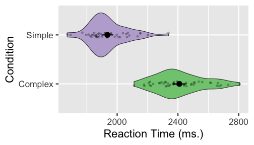<!-- --> --- # Raincloud Plots <!-- --> .footnote[Allen M, Poggiali D, Whitaker K et al. Raincloud plots: a multi-platform tool for robust data visualization [version 1; peer review: 2 approved]. Wellcome Open Res 2019, 4:63 https://doi.org/10.12688/wellcomeopenres.15191.1 ] --- # Using Different Themes You can change the ggplot theme to a number of built in ones (or define your own.) On the next page you'll see the same plot with (a) the Economist theme, (b) the fivethirtyeight theme, (c) the Tufte theme, and (d) the solarized theme. Below is the plot with the default theme. .center[ <!-- --> ] --- class: center, middle <!-- --> --- class: center, middle <!-- --> --- class: center, middle <!-- --> --- class: center, middle <!-- --> --- # The BBC Cookbook The BBC (like many other organisations such as the FT) use R and ggplot to generate their data They have even published their own style guide and code for their BBC data visualization theme. https://bbc.github.io/rcookbook/ .center[ <img src="images/bbc.png" width="80%" /> ] --- # World Happiness Data We can have a look at the World Happiness dataset that measures Happiness (called Life Ladder) and a bunch of other things (e.g., GDP) over countries over time. .center[ ```r vis_dat(happy_data) ``` <!-- --> ] --- .center[ ```r vis_miss(happy_data) ``` <!-- --> ] --- .top[ 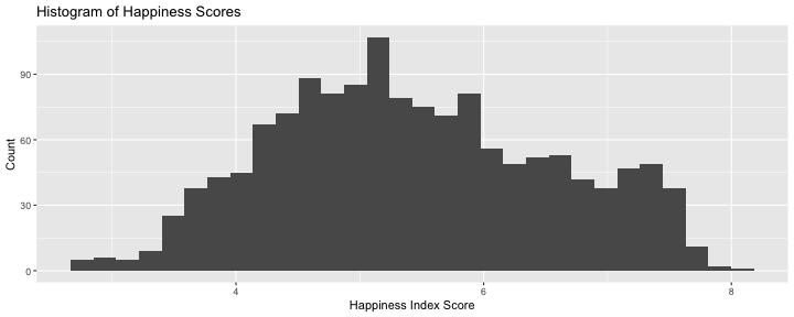<!-- --> ] .bottom[ ```r happy_data %>% ggplot(aes(x = `Life Ladder`)) + geom_histogram() + labs(x = "Happiness Index Score", y = "Number of Instances", title = "Histogram of Happiness Scores") ``` ] --- .top[ 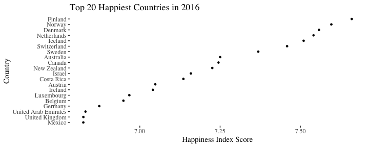<!-- --> ] .bottom[ ```r happy_data %>% filter(!is.na(`Life Ladder`) & year == 2016) %>% mutate(score = `Life Ladder`) %>% mutate(country = reorder(country, score)) %>% top_n(20) %>% ggplot(aes(x = score, y = country)) + geom_point() + labs(x = "Happiness Index Score", y = "Country", title = "Top 20 Happiest Countries in 2016") + theme_tufte(base_size = 15) ``` ] --- .top[ 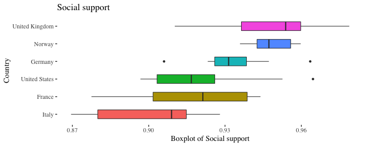<!-- --> ] .bottom[ ```r country_list <- c("United Kingdom", "France", "Germany", "Italy", "Norway", "United States") happy_data %>% filter(country %in% country_list) %>% filter(!is.na(`Social support`)) %>% mutate(score = `Social support`) %>% mutate(country = reorder(country, score)) %>% ggplot(aes(y = score, x = country, fill = country)) + geom_boxplot(width = .5) + labs(y = "Boxplot of Social support", x = "Country", title = "Social support") + guides(fill = FALSE) + coord_flip() + theme_tufte(base_size = 15) ``` ] --- .top[ 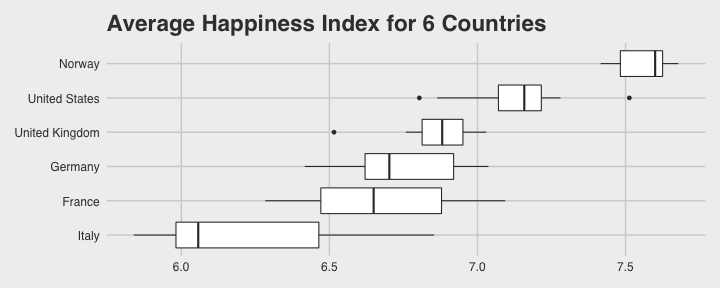<!-- --> ] .bottom[ ```r happy_data %>% filter(country %in% country_list) %>% mutate(score = `Life Ladder`) %>% mutate(country = reorder(country, score)) %>% ggplot(aes(x = country, y = score)) + geom_boxplot() + labs(x = "Country", y = "Happiness Index Score", title = "Average Happiness Index for 6 Countries") + coord_flip() + theme_fivethirtyeight(base_size = 15) ``` ] --- .top[ <!-- --> ] .bottom[ ```r country_list <- c("United Kingdom", "France", "Germany", "Italy", "Norway", "United States") happy_data %>% filter(country %in% country_list) %>% group_by(year) %>% filter(!is.na(`Life Ladder`)) %>% ggplot(aes(x = year, y = `Life Ladder`)) + geom_line() + facet_wrap(~ country) + labs(x = "Year", y = "Happiness index", title = "Happiness Index over Time for 6 Countries") + theme_fivethirtyeight(base_size = 15) + theme(axis.text.x = element_text(angle = 45, hjust = 1)) ``` ] --- # Visualising Data from Twitter Scraping Twitter using the rtweet() package for everyone's favourite progressive Swedish death metal band, Opeth! 🤘 <p> .center[ <!-- --> ] --- class: centre # Geospatial Plotting of Tweets .center[ <div id="htmlwidget-af31fcf2b1bdbba72aec" style="width:576px;height:432px;" class="leaflet html-widget"></div> <script type="application/json" data-for="htmlwidget-af31fcf2b1bdbba72aec">{"x":{"options":{"crs":{"crsClass":"L.CRS.EPSG3857","code":null,"proj4def":null,"projectedBounds":null,"options":{}}},"calls":[{"method":"addTiles","args":["//{s}.tile.openstreetmap.org/{z}/{x}/{y}.png",null,null,{"minZoom":0,"maxZoom":18,"tileSize":256,"subdomains":"abc","errorTileUrl":"","tms":false,"noWrap":false,"zoomOffset":0,"zoomReverse":false,"opacity":1,"zIndex":1,"detectRetina":false,"attribution":"© <a href=\"http://openstreetmap.org\">OpenStreetMap<\/a> contributors, <a href=\"http://creativecommons.org/licenses/by-sa/2.0/\">CC-BY-SA<\/a>"}]},{"method":"addCircles","args":[[null,null,null,null,null,null,null,null,null,null,null,null,null,null,null,null,null,null,null,null,null,null,null,null,null,null,null,null,null,null,null,null,null,null,null,null,null,null,null,null,null,null,null,null,null,null,null,null,null,null,null,null,null,null,null,null,null,null,null,null,null,null,null,null,null,null,null,null,null,null,null,null,null,null,null,null,null,null,null,null,null,null,null,null,null,null,null,null,null,null,null,null,null,null,null,null,null,null,null,null,null,null,null,null,null,null,null,null,null,null,null,null,null,null,null,null,null,null,null,null,null,null,null,null,null,null,null,null,null,null,null,null,null,null,null,null,null,null,null,null,null,null,null,null,null,null,null,null,null,null,null,null,null,null,null,null,null,null,null,null,null,null,null,null,null,null,null,null,null,null,null,null,null,null,null,null,null,null,null,null,null,null,null,null,null,null,null,null,null,null,null,null,null,null,null,null,null,null,null,null,null,null,null,null,null,null,null,null,null,null,null,null,null,null,null,null,null,null,null,null,null,null,null,-37.97256651425,null,null,null,null,null,null,null,null,null,null,null,null,null,null,null,null,null,null,null,null,null,null,null,null,null,null,null,null,null,null,null,null,null,null,null,null,null,null,null,null,null,null,null,null,null,null,null,null,null,null,null,null,null,null,null,null,null,null,null,null,null,null,null,null,null,null,null,null,null,null,null,null,null,null,null,null,null,null,null,null,null,null,null,null,null,null,null,null,null,null,null,null,null,null,null,null,null,null,null,null,null,null,null,null,null,null,null,null,null,null,null,null,null,null,null,null,null,null,null,null,null,null,null,null,null,null,41.12715476,null,null,null,null,null,null,41.0213205,null,41.0213205,null,null,null,null,null,null,null,null,null,null,null,null,null,null,null,null,null,null,null,null,null,null,null,null,null,null,null,null,null,null,null,null,null,null,null,null,null,null,null,null,null,null,null,null,null,null,null,null,null,null,null,null,null,null,null,null,null,null,null,null,null,null,null,null,null,null,null,null,null,41.0213205,null,null,41.12692018,null,null,null,null,null,null,null,null,null,null,null,null,null,41.0213205,null,null,null,null,null,null,null,null,null,null,null,null,null,null,null,null,null,null,null,null,null,null,null,null,null,null,null,-2.6292855,-2.6292855,null,null,null,null,null,null,null,null,null,null,null,null,null,null,null,null,null,null,null,null,null,null,null,null,null,null,null,null,null,null,null,null,null,null,null,null,null,null,null,null,null,null,null,null,null,null,null,null,null,null,null,null,null,null,null,null,null,null,null,null,null,null,null,null,null,null,null,null,null,null,null,null,null,null,null,null,null,null,null,null,null,null,null,null,null,null,null,null,null,null,null,null,null,null,null,null,null,null,null,null,null,null,null,null,null,20.7906572,null,null,null,null,null,null,null,null,null,null,-23.7107695,null,null,null,null,null,null,null,null,null,null,null,null,null,null,null,null,null,null,null,null,null,null,null,null,null,null,null,null,null,null,null,null,null,null,null,null,null,null,null,null,null,null,null,null,null,null,null,null,null,null,null,null,null,null,null,null,null,null,null,null,null,null,null,null,null,null,null,null,null,null,null,null,null,null,null,null,null,null,null,null,null,28.368525,null,null,null,null,null,null,null,null,null,null,null,null,null,null,null,null,null,null,null,null,null,null,19.28432165,null,null,null,null,null,null,null,null,null,null,null,null,null,null,null,null,null,null,null,null,null,null,null,null,null,null,29.59624885,null,null,null,null,null,null,null,null,null,null,null,null,null,null,null,null,null,null,null,null,null,null,null,null,null,null,null,null,null,null,null,null,30.361857,null,null,null,null,null,null,null,null,null,null,null,null,null,null,null,null,null,null,null,null,null,null,null,null,null,null,null,null,null,null,null,null,null,null,null,null,null,null,null,null,null,null,null,null,null,null,null,null,null,null,null,null,null,null,null,null,null,null,null,null,null,null,null,null,null,null,null,null,null,null,null,null,null,null,null,null,null,null,null,null,null,null,null,null,null,51.316522,null,null,null,null,null,null,null,null,null,null,null,null,null,null,null,null,null,null,null,null,null,null,null,null,null,null,null,null,null,null,null,null,null,null,null,null,null,null,null,null,null,null,null,null,null,41.7337898,null,null,null,null,null,null,null,null,null,null,null,null,null,null,null,null,null,null,null,null,null,null,null,null,null,null,null,null,null,null,null,null,null,null,null,null,null,null,null,null,null,null,null,null,null,null,null,null,null,38.4079305,null,null,null,null,null,null,null,null,null,null,null,null,null,19.518656,null,null,null,null,null,null,null,null,null,null,null,null,null,null,null,null,null,null,null,null,null,null,null,null,null,null,null,null,null,null,null,null,null,null,null,null,null,null,null,null,null,null,null,null,null,null,null,null,null,null,null,null,null,null,null,null,null,null,null,null,null,null,39.8618361,null,null,null,null,null,null,null,null,null,null,null,null,null,null,null,null,null,null,null,null,null,null,null,null,null,null,null,null,null,null,null,null,null,null,null,null,null,null,null,null,null,null,null,null,null,null,null,null,null,null,null,null,null,null,null,null,null,null,null,null,null,null,null,null,null,null,null,null,null,null,null,null,null,null,null,null,null,null,null,null,null,null,null,null,null,null,null,null,null,null,null,null,null,null,null,null,null,null,null,null,null,null,null,null,null,null,null,null,null,null,null,null,null,null,null,null,null,null,null,null,null,null,null,null,null,null,null,null,null,null,null,null,null,null,null,null,null,null,null,null,null,null,null,null,null,null,null,null,null,null,null,null,null,null,null,null,null,null,null,null,null,null,null,null,null,null,null,null,null,null,null,43.8806945,43.8806945,null,null,null,null,null,null,null,null,null,null,null,null,null,null,null,null,null,null,null,null,null,null,null,null,null,null,null,null,null,null,null,null,null,null,null,null,null,null,null,null,null,null,null,null,null,null,null,null,null,null,null,null,null,null,null,null,null,null,null,null,null,null,null,null,null,52.76132755,null,null,null,null,null,null,null,null,null,null,null,null,null,null,null,null,null,null,null,null,null,null,null,null,null,null,null,null,null,null,null,null,null,null,null,null,null,null,null,null,null,null,null,null,null,null,null,null,null,37.2376652,null,null,null,null,null,null,null,null,null,null,null,null,null,null,null,null,null,null,null,null,null,null,null,null,null,null,null,null,null,null,null,null,null,null,null,-22.5243471,null,null,null,null,null,null,null,null,null,null,null,null,null,null,60.18646976,null,null,null,null,null,null,null,null,null,null,null,null,null,null,null,null,null,null,null,null,null,null,null,null,null,null,null,41.0262045,null,null,null,null,null,null,null,null,null,null,null,null,null,null,null,null,null,null,null,null,null,null,null,null,null,null,null,null,null,null,null,null,null,null,null,60.18656639,null,null,null,null,null,null,null,null,null,null,null,null,null,null,59.9724055,null,null,57.59916175,null,null,null,null,null,null,41.6135944,null,null,null,40.95437685,null,null,null,null,null,null,null,null,null,null,null,null,null,null,null,null,null,37.7706565,null,null,null,null,null,null,null,null,null,null,null,null,null,null,null,null,null,null,null,null,null,null,null,null,null,null,null,null,null,null,null,null,-25.3002637,null,null,null,null,null,null,null,null,null,null,null,null,null,null,null,null,null,null,null,null,null,null,null,null,null,null,null,null,null,null,null,null,null,null,null,null,null,null,null,null,null,null,null,null,null,null,null,null,null,null,null,null,null,null,null,null,null,null,null,null,null,null,null,null,null],[null,null,null,null,null,null,null,null,null,null,null,null,null,null,null,null,null,null,null,null,null,null,null,null,null,null,null,null,null,null,null,null,null,null,null,null,null,null,null,null,null,null,null,null,null,null,null,null,null,null,null,null,null,null,null,null,null,null,null,null,null,null,null,null,null,null,null,null,null,null,null,null,null,null,null,null,null,null,null,null,null,null,null,null,null,null,null,null,null,null,null,null,null,null,null,null,null,null,null,null,null,null,null,null,null,null,null,null,null,null,null,null,null,null,null,null,null,null,null,null,null,null,null,null,null,null,null,null,null,null,null,null,null,null,null,null,null,null,null,null,null,null,null,null,null,null,null,null,null,null,null,null,null,null,null,null,null,null,null,null,null,null,null,null,null,null,null,null,null,null,null,null,null,null,null,null,null,null,null,null,null,null,null,null,null,null,null,null,null,null,null,null,null,null,null,null,null,null,null,null,null,null,null,null,null,null,null,null,null,null,null,null,null,null,null,null,null,null,null,null,null,null,null,145.053135344,null,null,null,null,null,null,null,null,null,null,null,null,null,null,null,null,null,null,null,null,null,null,null,null,null,null,null,null,null,null,null,null,null,null,null,null,null,null,null,null,null,null,null,null,null,null,null,null,null,null,null,null,null,null,null,null,null,null,null,null,null,null,null,null,null,null,null,null,null,null,null,null,null,null,null,null,null,null,null,null,null,null,null,null,null,null,null,null,null,null,null,null,null,null,null,null,null,null,null,null,null,null,null,null,null,null,null,null,null,null,null,null,null,null,null,null,null,null,null,null,null,null,null,null,null,null,29.02133659,null,null,null,null,null,null,29.0052228,null,29.0052228,null,null,null,null,null,null,null,null,null,null,null,null,null,null,null,null,null,null,null,null,null,null,null,null,null,null,null,null,null,null,null,null,null,null,null,null,null,null,null,null,null,null,null,null,null,null,null,null,null,null,null,null,null,null,null,null,null,null,null,null,null,null,null,null,null,null,null,null,null,29.0052228,null,null,29.02145863,null,null,null,null,null,null,null,null,null,null,null,null,null,29.0052228,null,null,null,null,null,null,null,null,null,null,null,null,null,null,null,null,null,null,null,null,null,null,null,null,null,null,null,-44.3025505,-44.3025505,null,null,null,null,null,null,null,null,null,null,null,null,null,null,null,null,null,null,null,null,null,null,null,null,null,null,null,null,null,null,null,null,null,null,null,null,null,null,null,null,null,null,null,null,null,null,null,null,null,null,null,null,null,null,null,null,null,null,null,null,null,null,null,null,null,null,null,null,null,null,null,null,null,null,null,null,null,null,null,null,null,null,null,null,null,null,null,null,null,null,null,null,null,null,null,null,null,null,null,null,null,null,null,null,null,-103.4847745,null,null,null,null,null,null,null,null,null,null,-46.422691,null,null,null,null,null,null,null,null,null,null,null,null,null,null,null,null,null,null,null,null,null,null,null,null,null,null,null,null,null,null,null,null,null,null,null,null,null,null,null,null,null,null,null,null,null,null,null,null,null,null,null,null,null,null,null,null,null,null,null,null,null,null,null,null,null,null,null,null,null,null,null,null,null,null,null,null,null,null,null,null,null,76.974691,null,null,null,null,null,null,null,null,null,null,null,null,null,null,null,null,null,null,null,null,null,null,-99.655676,null,null,null,null,null,null,null,null,null,null,null,null,null,null,null,null,null,null,null,null,null,null,null,null,null,null,31.57060625,null,null,null,null,null,null,null,null,null,null,null,null,null,null,null,null,null,null,null,null,null,null,null,null,null,null,null,null,null,null,null,null,-87.161081,null,null,null,null,null,null,null,null,null,null,null,null,null,null,null,null,null,null,null,null,null,null,null,null,null,null,null,null,null,null,null,null,null,null,null,null,null,null,null,null,null,null,null,null,null,null,null,null,null,null,null,null,null,null,null,null,null,null,null,null,null,null,null,null,null,null,null,null,null,null,null,null,null,null,null,null,null,null,null,null,null,null,null,null,null,-0.54883575,null,null,null,null,null,null,null,null,null,null,null,null,null,null,null,null,null,null,null,null,null,null,null,null,null,null,null,null,null,null,null,null,null,null,null,null,null,null,null,null,null,null,null,null,null,27.21516645,null,null,null,null,null,null,null,null,null,null,null,null,null,null,null,null,null,null,null,null,null,null,null,null,null,null,null,null,null,null,null,null,null,null,null,null,null,null,null,null,null,null,null,null,null,null,null,null,null,27.00651085,null,null,null,null,null,null,null,null,null,null,null,null,null,-99.1158907,null,null,null,null,null,null,null,null,null,null,null,null,null,null,null,null,null,null,null,null,null,null,null,null,null,null,null,null,null,null,null,null,null,null,null,null,null,null,null,null,null,null,null,null,null,null,null,null,null,null,null,null,null,null,null,null,null,null,null,null,null,null,32.84532615,null,null,null,null,null,null,null,null,null,null,null,null,null,null,null,null,null,null,null,null,null,null,null,null,null,null,null,null,null,null,null,null,null,null,null,null,null,null,null,null,null,null,null,null,null,null,null,null,null,null,null,null,null,null,null,null,null,null,null,null,null,null,null,null,null,null,null,null,null,null,null,null,null,null,null,null,null,null,null,null,null,null,null,null,null,null,null,null,null,null,null,null,null,null,null,null,null,null,null,null,null,null,null,null,null,null,null,null,null,null,null,null,null,null,null,null,null,null,null,null,null,null,null,null,null,null,null,null,null,null,null,null,null,null,null,null,null,null,null,null,null,null,null,null,null,null,null,null,null,null,null,null,null,null,null,null,null,null,null,null,null,null,null,null,null,null,null,null,null,null,null,-79.2996725,-79.2996725,null,null,null,null,null,null,null,null,null,null,null,null,null,null,null,null,null,null,null,null,null,null,null,null,null,null,null,null,null,null,null,null,null,null,null,null,null,null,null,null,null,null,null,null,null,null,null,null,null,null,null,null,null,null,null,null,null,null,null,null,null,null,null,null,null,0.419867,null,null,null,null,null,null,null,null,null,null,null,null,null,null,null,null,null,null,null,null,null,null,null,null,null,null,null,null,null,null,null,null,null,null,null,null,null,null,null,null,null,null,null,null,null,null,null,null,null,-6.91868315,null,null,null,null,null,null,null,null,null,null,null,null,null,null,null,null,null,null,null,null,null,null,null,null,null,null,null,null,null,null,null,null,null,null,null,-44.080922,null,null,null,null,null,null,null,null,null,null,null,null,null,null,24.97180673,null,null,null,null,null,null,null,null,null,null,null,null,null,null,null,null,null,null,null,null,null,null,null,null,null,null,null,-73.754737,null,null,null,null,null,null,null,null,null,null,null,null,null,null,null,null,null,null,null,null,null,null,null,null,null,null,null,null,null,null,null,null,null,null,null,24.97338295,null,null,null,null,null,null,null,null,null,null,null,null,null,null,10.7215259,null,null,-4.43519605,null,null,null,null,null,null,21.743291,null,null,null,-5.67914705,null,null,null,null,null,null,null,null,null,null,null,null,null,null,null,null,null,-122.4359785,null,null,null,null,null,null,null,null,null,null,null,null,null,null,null,null,null,null,null,null,null,null,null,null,null,null,null,null,null,null,null,null,-57.60601775,null,null,null,null,null,null,null,null,null,null,null,null,null,null,null,null,null,null,null,null,null,null,null,null,null,null,null,null,null,null,null,null,null,null,null,null,null,null,null,null,null,null,null,null,null,null,null,null,null,null,null,null,null,null,null,null,null,null,null,null,null,null,null,null,null],40,null,null,{"interactive":true,"className":"","stroke":true,"color":"#fb3004","weight":8,"opacity":0.5,"fill":true,"fillColor":"#fb3004","fillOpacity":0.8},null,null,null,{"interactive":false,"permanent":false,"direction":"auto","opacity":1,"offset":[0,0],"textsize":"10px","textOnly":false,"className":"","sticky":true},null,null]}],"limits":{"lat":[-37.97256651425,60.18656639],"lng":[-122.4359785,145.053135344]}},"evals":[],"jsHooks":[]}</script> ] --- class: middle, center # Teaching with Animations --- # Data Simulations and Data Visualisation - Hockey Game Simulation Imagine a hockey game where we know that Team A scores exactly 1 goal for sure and Team B takes 20 shots, each with a 5.5% chance of going in. Which team would you rather be? (nothing additional happens if you tie.) ```r set.seed(1234) team_b_goals <- NULL for(i in 1:10000) { score <- sum(sample(c(1, 0), size = 20, replace = TRUE, prob = c(0.055, 1-.055))) team_b_goals <- c(team_b_goals, score)} team_a_goals <- rep(1, 10000) all_games <- as_tibble(cbind(team_a_goals, team_b_goals)) ``` --- ``` ## [1] "Games where Team A scores more goals than Team B: 3145" ``` ``` ## [1] "Games where Team A scores fewer goals than Team B: 3050" ``` ``` ## [1] "Games where there is a tie : 3805" ``` .center[ <!-- --> ] --- class: middle, center <!-- --> --- # Sample size of 25 when population r = .5 .center[ <!-- --> ] --- # Sample size of 250 when population r = .5 .center[ <!-- --> ] --- # Binder for fully reproducible computational environments On the previous slides, we saw a number of example visualizations and associated code. Open code is great, but we also need to ensure we share our computational environment so our code can be re-run (and produce the same output). We need to capture the versions of the different R packages we're using (plus their dependencies). May sound trivial but trying running some old R code and be amazed at how many things now don’t work as they once did! Many R packages have introduced 'breaking changes' when they have been updated. --- # Binder, BinderHub, and repro2docker Binder is powered by BinderHub, which is an open-source tool that deploys the Binder service in the cloud. Binder works by pulling a repository that you set up on GitHub into a Docker container. Docker packages your data, code and all its dependencies in the form called a docker container to ensure that your application works seamlessly in any environment. .center[ <img src="images/docker.png" width="50%" /> ] --- class: middle, center <img src="images/binder1.png" width="80%" /> <!-- --> --- class: middle, center # But you don't need to worry about any of that! --- # Step 1 - Set up a GitHub account <img src="images/binder2.png" width="1365" /> --- # Step 2 - Create a new public repository <img src="images/binder3.png" width="1255" /> --- # Step 3 - Upload your R script and data and make your first “Commit” <img src="images/binder4.png" width="1276" /> --- # Step 3 - Upload your R script and data and make your first “Commit” We need two other files at this point - one is called “runtime.txt” and contains the date of R and its associated packages that you want to simulate. The other is called “install.R” and contains the list of R packages that need to be installed in order for your script to run. To create a new file select “Create new file”. <img src="images/binder5.png" width="603" /> --- <img src="images/binder6.png" width="1252" /> --- # Step 5 - Now we need to link our repo to Binder (mybinder.org) <img src="images/binder7.png" width="1308" /> --- <img src="images/binder8.png" width="1187" /> Paste the first bit of code into your GitHub repo README.md - you’ll then be able to click on the ‘launch binder’ button in your repository to launch the actual binder once it has been built - makes it easy for others to go from you GitHub repo to your code running in Binder. --- # Once you click ‘Launch’… <img src="images/binder9.png" width="1163" /> --- class: center, middle <img src="images/obi.gif" width="150%" /> --- class: middle If Binder can find an image that you’ve built previously, it will simply launch that. If you’ve made changes to your GitHub repo, it will rebuild the Docker image and create a new Binder. And then... .center[ <img src="images/han.gif" width="50%" /> ] --- # Ta da! .center[ <img src="images/binder10.png" width="1152" height="50%" /> ] --- # A few key things... Installing the entire Tidyverse in a Binder can take a long time - better to install only the packages you use (e.g., ggplot2, dplyr, readr etc.) - this will also ensure the packages are consistent with the date in your runtime.txt file. Even with just a couple of packages it can take ~15 minutes or so for your Binder to be built. Some R packages need system-level packages to also be installed - you can do that via an additional apt.txt file which lists those packages - this is used by apt-install to install those packages from the Ubuntu apt repository. At the moment, you can’t change the version of R that runs on Binder (currently set to 3.4.4.) via the runtime.txt file so need to go down the dockerfile route using the holepunch package - link to additional slides at the end of our [hackmd.io](https://hackmd.io/wlp5EX3ATK2ZCqjnx9DKLg?view) doc. You can close your laptop if Binder is taking too long - the image and your Binder will continue to be built in the Cloud. And it’s always a good excuse for another coffee… --- # For Ultimate Reproducibility Make sure you have updated all your packages before you run your script. Build your Binder and specify the day you ran your analysis in the runtime.txt file. Patience (young Skywalker) while your Binder builds… --- # Now for your data visualization backwards coding challenge... Ideally in groups (assuming a range of skill levels), generate R code that will re-create each of the following visualizations. The data are SNCF train data from a TidyTuesday. All instructions for loading the data and the workshop are in the hackmd.io document below. https://hackmd.io/wlp5EX3ATK2ZCqjnx9DKLg?view After you have re-created each visualization, create a GitHub repo of your script, a runtime.txt file, and an install.R file. Then create a Binder from your repo. While your Binder is building, move onto the next visualization challenge. At the end of the workshop, you should each have 6 R scripts, 6 new GitHub repositories, and a Binder associated with each of the 6 repositories. --- # Visualization 1 .middle[ .center[ <!-- --> ] ] --- # Visualization 2 .middle[ .center[ <!-- --> ] ] --- # Visualization 3 .middle[ .center[ <!-- --> ] ] --- # Visualization 4 .middle[ .center[ <!-- --> ] ] --- # Visualization 5 .middle[ .center[ <!-- --> ] ] --- # Visualization 6 .middle[ .center[ <!-- --> ] ] --- # For the animated plot (Visualization 6)... In addition to the runtime.txt and install.R files, you will also need to create an apt.txt file as the gganimate package requires a system level installation of magick. Create your apt.txt file in your GitHub repo as you would the runtime.txt file, and add the following lines: ```r libmagick++-dev cargo ``` Your install.R file will probably also need to include the following: ```r install.packages("gganimate") install.packages("ggimage") install.packages("gifski") install.packages("png") ``` But for now... --- class: center, middle <img src="images/pooh.gif" width="75%" />